Knowing Navy
- Hex
- #0C193A
- RGB
- 12, 25, 58
- CMYK
- 98, 89, 45, 56
- Pantone
- 289 C
Quisitive
Quisitive helps organizations simplify complex technology and turn it into meaningful business outcomes. With deep Microsoft expertise, we empower businesses to harness AI, modernize operations, and move forward with clarity and confidence.
The core of our brand

The Quisitive logo reflects a modern, confident approach to technology. Its distinctive “Q” mark creates a recognizable visual signature, while the clean wordmark communicates clarity and approachability. Together, they create a strong and versatile foundation for the Quisitive brand.
Only set it in the following approved colorways, primarily showcasing the wordmark in Cyan-Black and Cyan-White.

Logo Primary Wordmark Cyan & White
Download PNG Logo Primary Wordmark Cyan & Black
Download PNG
Logo Primary Wordmark True White
Download PNG
Logo Primary Wordmark True Black
Download PNG
The Quisitive icon distills the brand into a simple, recognizable mark. Built from the distinctive “Q,” its open form and circular structure suggest curiosity, connection, and forward movement—reflecting Quisitive’s approach to navigating complex technology with clarity
Only set it in the following approved colorways, primarily showcasing the Icon mark in Cyan-Black and Cyan-White.

Logo Primary Icon Cyan & White
Download PNG Logo Primary Icon Cyan & Black
Download PNG
Logo Primary Icon True White
Download PNG
Logo Primary Icon True Black
Download PNGour logo

When displaying any of the logo variations, maintain ample space around it to avoid crowding or interference from other elements. To achieve this, don’t place anything within the “safe space” equivalent to 10% the width of the logo.
*Of course, there are exceptions: subtle patterns or textures overlapping at 20% opacity or less are acceptable.

Use unapproved color combinations or colors

Distort the logo and elements

Mask images into the logo

Place on backgrounds that make elements hard to read
Quisitive in
Knowing Navy
Cutting-Edge Cream
Winning White
Secondary colors are intended to support the primary palette by introducing depth and visual interest across the brand. They work best as accents for backgrounds, shapes, callouts, and supporting brand elements.
Reliable Royal
Growth Green
Signaling Cyan
Leading Light Blue
New Blue
Our tertiary color, baseline back is mainly intended for body copy on web and collateral.
Baseline Black
Typography
Century Gothic is primary font family for the broader Quisitive team. Use in all PowerPoint decks and sales collateral in the following defined type levels.
Microsoft Alternative, Subheadings, Century Gothic Bold (+100 Tracking)
A B C D E F G H I J K L M N O P Q R S T U V W X Y Z 1 2 3 4 5 6 7 8 9 0 ! @ # $ % ^ &
Microsoft Alternative, Headings, Century Gothic Regular
A B C D E F G H I J K L M N O P Q R S T U V W X Y Z 1 2 3 4 5 6 7 8 9 0 ! @ # $ % ^ &
Microsoft Alternative, Body Copy, Century Gothic Regular
A B C D E F G H I J K L M N O P Q R S T U V W X Y Z 1 2 3 4 5 6 7 8 9 0 ! @ # $ % ^ &
Typography
Franie and Host Grotesk are our primary font families for our in-house branded applications. Use in all web, ad, and marketing materials.
Licenses are provided to the Quisitive brand team. If you would like to request a license, please reach out to your supervisor.
Subheadings, Franie Regular, All Caps, +100 Tracking
A B C D E F G H I J K L M N O P Q R S T U V W X Y Z 1 2 3 4 5 6 7 8 9 0 ! @ # $ % ^ &
Headings, Franie Semilight
A B C D E F G H I J K L M N O P Q R S T U V W X Y Z 1 2 3 4 5 6 7 8 9 0 ! @ # $ % ^ &
Body Copy, Host Grotesk Regular
A B C D E F G H I J K L M N O P Q R S T U V W X Y Z 1 2 3 4 5 6 7 8 9 0 ! @ # $ % ^ &
depth through

Geometric shapes add structure, movement, and visual interest to the Quisitive brand.
They can connect, overlap, and adapt across layouts, creating a flexible and modular system. Limit compositions to 3–5 shapes to maintain clarity and avoid visual clutter.

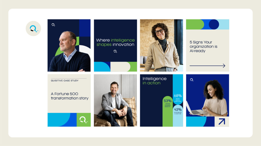
Photography highlights the people and expertise behind the technology through authentic, approachable moments.
Prioritize bright, natural lighting, real work environments, and clean backdrops to create a warm, modern aesthetic that reinforces trust, connection, and collaboration.
When selecting imagery, consider the overall color composition. Clothing, environments, and surrounding details should complement the Quisitive color palette, avoiding overly saturated or competing colors that feel disconnected from the brand.

To avoid overcrowding of compositions and inconsistent use of design elements, please avoid the following:

Use more than 5 shape elements in a single composition, or nest shapes inside one another

Break headlines, or use shapes as holding shapes for text

Over-represent the secondary colors
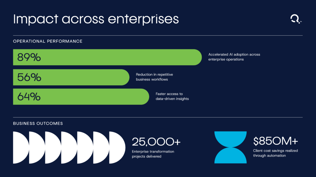
Use shapes in place of icons when representing data
Brand in action
Quisitive’s template library brings the new visual identity across a range of everyday materials, from presentations to sales flyers and more. Each template applies the brand’s typography, color, imagery, and graphic elements consistently, giving teams flexible, ready-to-use tools for creating polished and cohesive communications.
Download Templates Here